A Matter of taste or symbolic of the times? Article by Sally Pepper
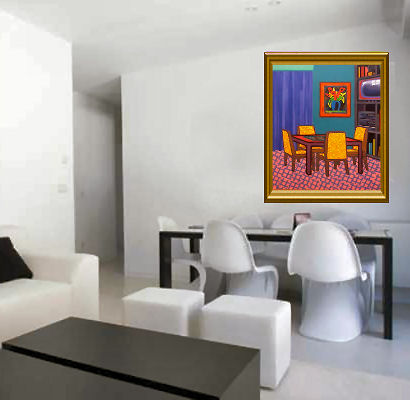
 The other day I retrieved a brochure with an illustration like this from my letter box. It was imploring me to take up residence in newly built apartments quite close to where I live. I guess that decor was supposed to sell the sterile looking place to me.
I wouldn't mind if it were a matter of some people choosing to live in this utter beige-ness but my problem is that the whole of Melbourne seems to be in the process of transformation into multiplications of this with a total lack of soul inside and out. They are replacing Edwardain wonders, 20s charm, 30s homeliness, 40s clinker (although not many were built in that decade) and 50s and 60s fun and funkiness.

Barry Humphries used to laugh at the floral axminster and the duck egg blue bedroom walls, the pink baths with matching basins or "vanities", the sandblasted glass double doors and the ducks on the wall.
That's all gone now. No-one would dare! Well no-one of ordinary means would dare venture into any strong colours because you always have to think of the re-sale value of the house, the possible taste of the unknown people who might one day buy your house. Another reason to stay conservative is that you could well be renting and I'm sure those landlords would prefer you to remain in the neutral colour range.
To me this brochure with above photo was sad. They were trying to sell me something with no personality. These promotions frequently spill out of my letter box and if not completely eaten by snails before I retrieve them a shudder goes through me with the thought that I too might be an inhabitant of such a mausoleum. Of course if someone else's personality shone through too strongly in a house I was contemplating I would probably want to subdue it and assert my own taste.
This photo of which we have all seen similar seems to characterize the style of the day, the acceptable digestible purchasable, constipated, safe, respectable human filing cabinet I loathe it . It’s as though it has been run through a machine to determine the colour scheme that won’t offend anyone and then it has been put together by a robot.

Give me the bad taste, the spontaneous joy and love of colour of the home makers of decades past that we enjoyed laughing about. The constrained neutral interior makes me feel more like crying. All it needs is to hang a Howard Arkley print on the wall and the irony of the situation would be complete.

Recent comments